Simplifying a new payment method for small businesses.
Client
SumUp
Year
2024
A digital experience designed to introduce Pix to SumUp customers and make adoption easier for small business owners.
Scope of Work

CONTEXT
SumUp is a payment solutions company focused on small businesses. In this project, the goal was to communicate the arrival of Pix to its customers and show how this new payment method could make receiving payments easier.
THE CHALLENGE
Pix brought a simple value proposition: receive payments within seconds, with no fees and at any time.
The challenge was making that value proposition resonate with the people who could benefit from it the most.
SumUp’s customers are largely small business owners who depend directly on their businesses for their income. Based on the user research materials provided by the brand, this audience has limited familiarity with technology, little experience with digital banking services, and strong concerns about costs and fees.
For this audience, presenting Pix as “a new technology” could create another barrier rather than generate interest.
The question became:
How might we turn a new financial technology into something small business owners recognize as useful, simple, and easy to incorporate into their daily routines?

INSIGHTS
The analysis of the available materials revealed that the challenge was not simply to introduce Pix, but to make it relevant and easy to understand for small merchants with limited familiarity with digital services.
The benefit comes before the technology: For this audience, receiving money faster and saving on fees is more relevant than learning about a new technology.
Simplicity is also a form of trust: The less familiar users are with digital services, the more important it is for communication to show that the process is simple.
“Money right away” speaks louder than “innovation”: Faster access to money connects directly with the financial reality of small businesses.
Questions needed to be answered before asking users to sign up: The communication needed to explain how Pix works and address potential objections before leading users to take action.

MOBILE FIRST
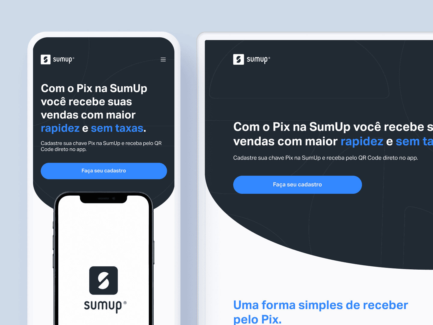
Mobile First was one of the main principles guiding the experience.
The decision was based on the user profile provided in the project: a user with limited digital familiarity who primarily relies on simple, everyday mobile tools such as WhatsApp. The persona itself reflected low familiarity with technology and limited use of apps.
For this reason, the experience was designed around the mobile context first, prioritizing:
Clear visual hierarchy
Important information needed to be identified quickly.Scannable content
Longer texts were organized into smaller sections to make them easier to read.Simple interactions
The experience needed to require as little cognitive effort as possible.Clear CTAs
The next step needed to be obvious at every stage.
The desktop version was then developed based on this structure.
THE SOLUTION
The solution was designed as an integrated communication journey connecting three moments: discovery, understanding, and action.
The first touchpoint was the email campaign, designed to introduce Pix to SumUp customers and spark interest by highlighting the benefits most relevant to small businesses.
From the CTA, users were directed to a mobile-first landing page, where the information was progressively expanded. The experience presented the benefits of Pix, explained how it works, and addressed questions that could create uncertainty or hesitation.
Finally, the journey directed users to the SumUp app, where they could sign up and start using Pix.
This sequence followed the journey defined in the brief: inform, generate interest, build understanding, and drive action.

RESULTS AND LEARNINGS
The solution transformed potentially complex communication into a clearer, action-oriented journey.
The combination of simple language, information hierarchy, and a mobile-first approach made it possible to communicate the value of Pix more directly, highlighting the benefits that matter most to small business owners.
As a perceived outcome, the value proposition could be understood within the first fold of the landing page, reducing the need for users to scroll through the entire page to understand the core benefit of the solution.
What started as a challenge to communicate a new technology to an audience with limited digital familiarity became an experience designed to communicate its value quickly, simply, and clearly.
This project reinforced that clarity is also a design decision.
For financial products, especially those aimed at audiences with lower digital familiarity, information architecture, language, and visual hierarchy play a fundamental role in turning a feature into a value proposition that users can easily understand.